I also started to make Ihana.
The Reason I started making Mox
I’d been using Fetchnotes for years for organising my learning notes. Whenever I made progress on any subject, I’d make a new entry on Fetchnotes. For example: “#programming #gamedev I just completed a chapter of Unity In Action”. Until… it died around winter last year.
And when I finally sensed that something was wrong in December, the back end was already dead and I couldn’t export my notes anymore. I guess I noticed it late because their front end still worked until maybe early February.
Thus started my journey of banging my head on my keyboard for at least two hours a day trying to make a clone of it so that I have somewhere to keep my learning notes.
To be honest, creating the RESTful API for the notes and the hashtags and building note and tag manipulation with Angular were the easiest part. You know, as long as you aren’t an idiot like me who liked to code first and read the docs later (and of course suffered the consequences of such moronic actions).
The first boss
The first boss that awakened my usually dormant urges to be violent on a daily basis was the JAVASCRIPT PROMISES. I started out as a Rails developer and this was my first time using an all-JS stack (except Meteor I mean), so when I discovered that these lines of code below:
$http.get('/notes');
console.log('got the notes for ya master');
would produce
got the notes for ya master
GET /notes 200
I just couldn’t understand why Javascript wanted me to die of frustration so badly.
But since then, like everybody else, I’ve grown used to the workflow of resolving promises and dealing with other async functions. They’re pretty great once you get to know them.
The second boss
The second boss that I’ve met and haven’t yet conquered (and I doubt I would anytime soon) is web design. I was used to making some simple typography changes on my part and leaving the rest to Bootstrap, Foundation or Materialize. However, if you spend even just one day browsing Dribbble or Behance, you’re bound to long for more and eventually reject these reliable but homely friends.
Now completely on my own, I found myself without a single clue as to how to pick a harmonious colour palette and how to create a coherent design. Making big rounded buttons, pretty input controls, and fancy h1 titles… that I could do, but as Mox was coming to life day by day, I realised that elements that may look pretty on their own do not necessarily make for an overall pretty design.
Screenshots of Mox
Here’s the earliest screenshot I made of Mox, taken on 21st December.
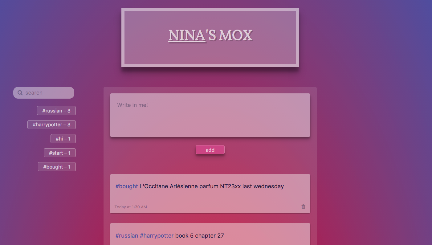
Never in my life have I experienced such a brutal realisation of just how much I sucked at design. Or anything related to arts.
At school I always got by in arts class by handing in my artsy friends’ work, and once in middle school, even my boyfriend’s Mario bead art.
So I guess this was my wakeup call. Make design and arts one of my primary learning goals or else I will forever bear the curse of birthing ugly web babies.
Let me show you some screenshots of Mox’s landing page evolution.
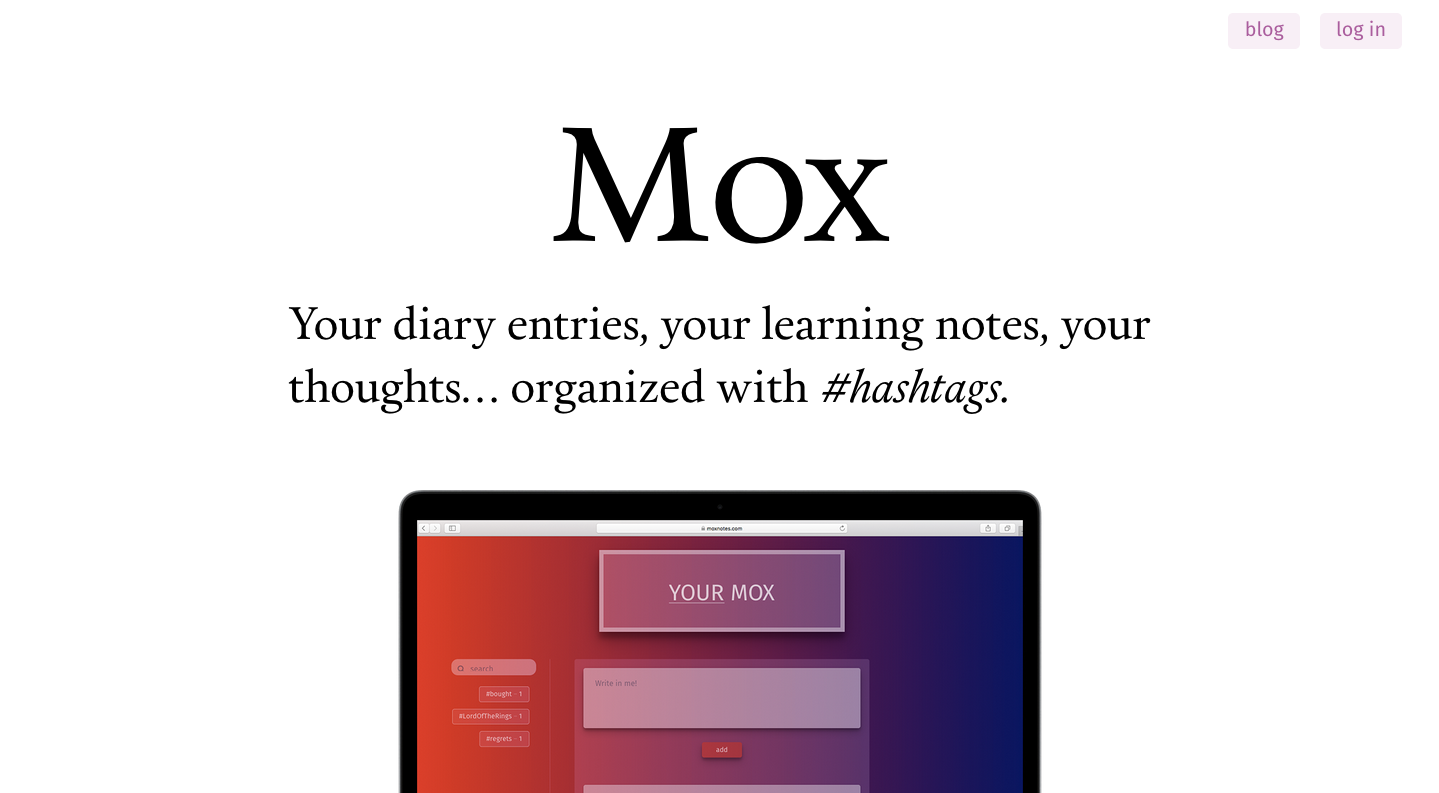
I’ve always been enamoured of the clean look of large, bold, attention-whoring typography combined with an elegant serif typeface (that was Calendas Plus in the screenshot above). But somehow when I do it myself, it gives off the vibes of no design at all.
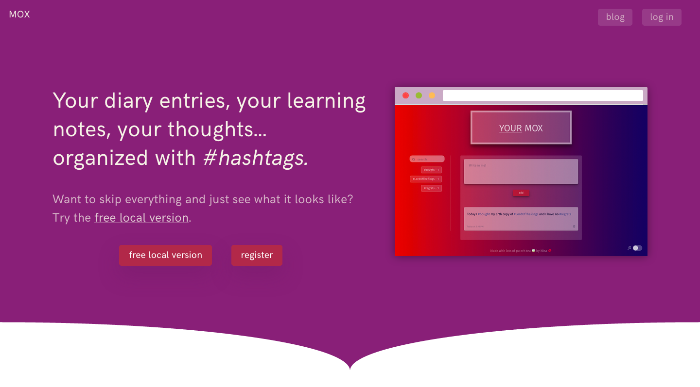
The current landing page. Generic, standard “creativity isn’t my strong suit” type of design. The colours are off because I took it in the middle of the night with F.lux at the highest settings. The reason I made this after the first one is because with this one maybe you’ll realise I did put effort into the design.
Enough of the frustrating part now. The feature I’m the most proud of making is the time period search feature (awkward name but oh well).
The happy part
I’ve always wondered why on Twitter, to find a tweet from last November for instance, I have to scroll down until I find it. Same thing with Fetchnotes. What progress did I make in Finnish last year? How many books did I read last month? What the hell did I do last summer? Let me waste 20 minutes of my youth that I’ll never get back scrolling down my dashboard to find those notes.
I thought allowing the users to be able to type in something like “2015 dec” or “2016” or “july” and also filter the notes with the hashtags they want would be perfect for me. For example, to find all the books you logged last month you’d simply type “2017 jan” and click the #books hashtag. No more scrolling down and squinting at the dates.
So I did it. I think that’s the only feature that differentiates Mox from other apps for notes with hashtags. Though I don’t know if others would share my need for that feature.
That’s all I will say about Mox for now. It is still very much a work in progress and my time would be better spent on fixing bugs and polishing the interface than whining about it.
About Ihana
As for Ihana, two weeks ago I started making it as a replacement for Biscuit the flashcard app on my phone. I spend more time on my laptop than my phone, so why not make a web version of it?
Core features of Ihana:
- Automatic translation with Yandex Translate for the word you put in and then press enter on (done)
- Flashcard notifications in the browser with custom interval (done)
- Ability to import and export the decks so that you won’t be locked in that service (looking at you, Biscuit, please let me export my decks) (not done yet)
- Cute hand-drawn cat icon (done, I’m proud of this one too as an artistically-challenged person)
- Quiz feature because my mum wants it (still haven’t decided if I want to do it)
And here are some screenshots. Please keep in mind that Ihana is still a new-born and nowhere near the feature-completeness of Mox.

This above is my account for showcase purpose.
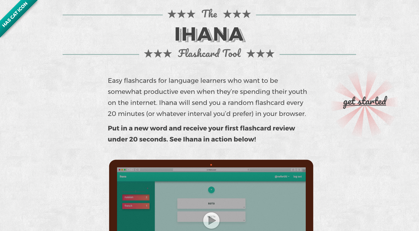
This above was meant to be a joke because of how troll it is, but I always end up liking my troll work better than my “trying to look acceptable” work.
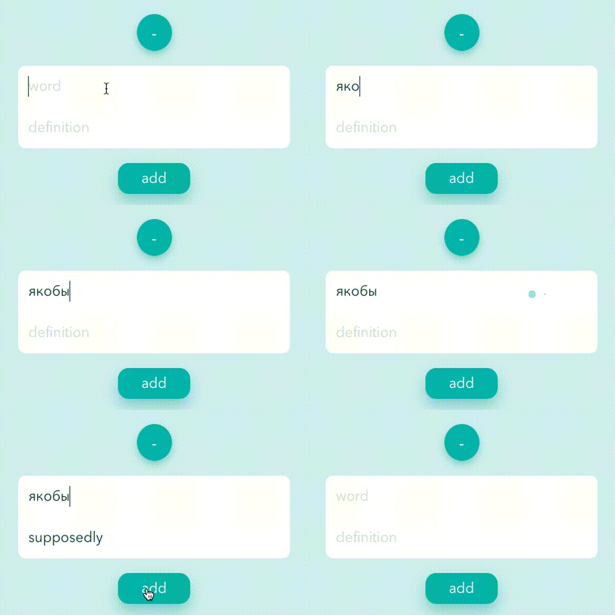
This above is a non-looping gif showing how the Yandex Translate API was integrated. So you may have to refresh the page to see it. Sorry for not making it loop forever.
It was nice putting into words all the heartache and wonder I’ve felt during these two months. Now back to coding I go!